 OpenAI Select Partner
Wireframes vs Mockups vs Prototypes: Which One Do You Need Before Building Your App?
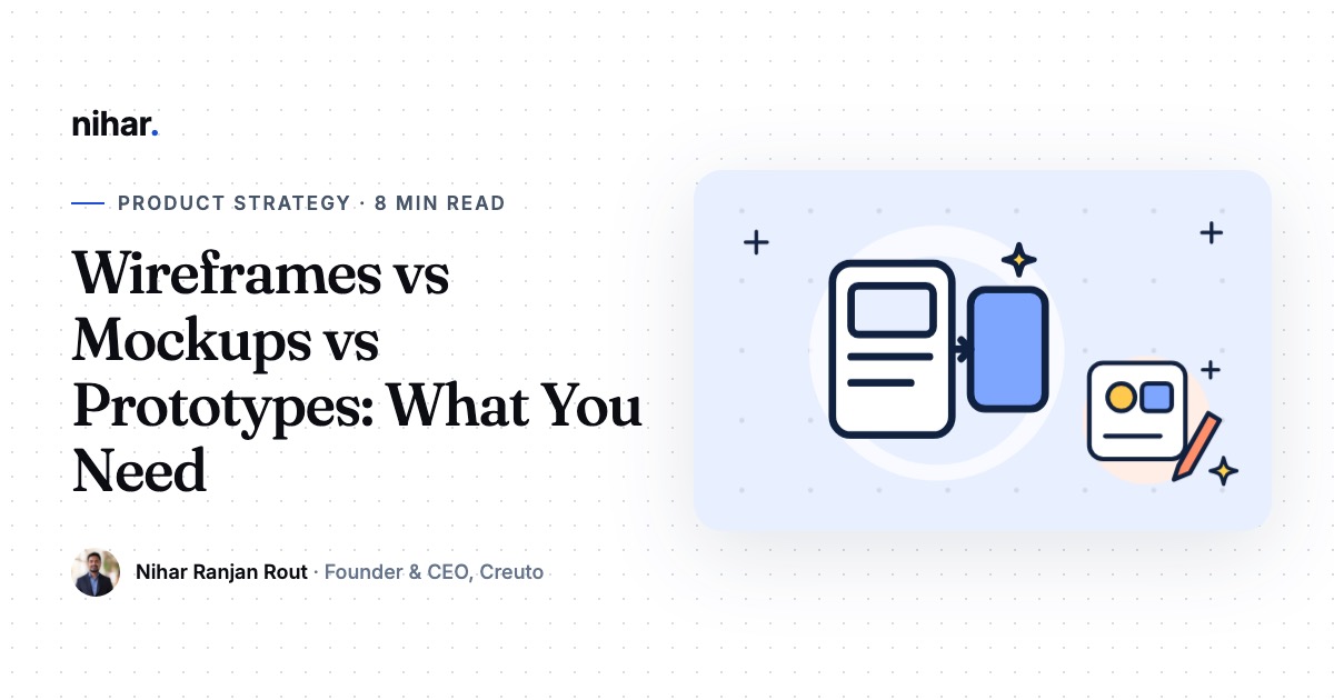
Before a single line of code is written, someone has to decide what each screen shows and how people move between them. Wireframes, mockups and prototypes are the three ways teams do that, and founders often pay for the wrong one first. Here is how I explain the difference, and what you actually need before you hire a team to build.

In this guide 9 sections
Founders often come to me with a set of polished app screens: brand colours, icons, illustrations, all finished. Then we walk through the main journey together and find a dead end, a missing step or a screen nobody planned. The visuals are fine. The structure underneath was never tested, and fixing it means redoing much of the visual work.
That is the most common design mistake I see before a build: paying for polish before the flow is settled. Wireframes, mockups and prototypes exist to stop exactly that, and each one answers a different question.
The short version
A wireframe answers "what is on each screen and in what order". A mockup answers "what does it look like". A prototype answers "does the flow work when someone tries it". Settle them in that order, and test the prototype with real users before you pay for development.
The three, side by side
| Wireframe | Mockup | Prototype | |
|---|---|---|---|
| What it is | A plain layout of a screen | A static, finished-looking screen | Linked screens you can tap through |
| Detail | Low: boxes, labels, grey placeholders | High: real colours, fonts, images | Low or high, but interactive |
| Question it answers | What goes where? | How should it look? | Does the journey make sense? |
| Who reviews it | Founder, product owner, developers | Founder, brand and marketing | Real target users, investors |
| Cheap to change? | Very | Moderately | Depends on the detail |
None of them is working software. That is the point. They let you make mistakes while mistakes are still cheap. If you are wondering how a design prototype differs from a proof of concept or an MVP, our guide on MVP vs prototype vs proof of concept covers that.
Wireframes: settle the structure
A wireframe strips a screen down to its bones. It shows which elements exist (a search bar, a list of results, a filter button, a price) and roughly where they sit. It deliberately leaves out colour and branding so nobody argues about shades of blue while the real question, whether the screen has the right content, is still open.
Wireframes are where you catch missing screens. When you draw the full journey, you notice the things a feature list hides: the empty state when there are no results, the error when a payment fails, the screen a user sees after they log out. Each of those is a screen someone has to build, and each one affects your estimate.
Make wireframes when: your product has more than a few screens, the flow is unusual, or several people need to agree on what the product does. Rough ones are fine. A photo of a whiteboard is a wireframe.
Mockups: decide the look
A mockup takes an agreed wireframe and makes it look real: your brand colours, typography, icons, imagery and exact spacing. This is where the product starts to feel like yours, and where you decide things like how bold the main button should be or how dense a list can get before it feels cluttered.
Good mockups follow the platform's own conventions, so the app feels natural on each device. Apple's Human Interface Guidelines and Google's Material Design describe those conventions, and they are worth a skim even if you are not a designer. Mockups are also the right stage to check colour contrast and text size against the WCAG accessibility guidelines, because fixing contrast later means touching every screen.
Make mockups when: the structure is agreed and you need developers to build pixel-accurate screens, or you need visuals for investors, a landing page or the app stores. If the difference between UI and UX design is still fuzzy, read UI vs UX design first.
Not sure what to design first?
Book a free 30-minute call. Show us your idea or your sketches and we will tell you which design step will save you the most rework.
Book a free 30-minute call →Prototypes: test the journey
A prototype links screens together so you can tap a button and land on the next screen, just as you would in the finished app. It can be built from wireframes (a low-fidelity prototype) or from mockups (a high-fidelity one). Either way, nothing behind it is real: no database, no login, no payment. It only feels like an app.
The value of a prototype comes from putting it in front of people. Give five people from your target audience a task, such as "book an appointment for Saturday", and watch them without helping. Where they hesitate, tap the wrong thing or ask a question, your design has a gap. You will learn more in an afternoon of these sessions than in weeks of internal debate.
Make a prototype when: you want to test a new idea with users before paying for development, you are raising money and need something tangible to show, or your main flow has several steps where people could get lost.
Which do you need, and in what order?
For most first products, this order keeps rework low:
- Write the PRD first. Know who the users are and what the first release must do. Our guide on how to write a PRD explains what to include.
- Wireframe the main journeys. Not every screen, just the flows that make or break the product.
- Turn the key flow into a clickable prototype and test it with real users.
- Fix what testing reveals, then move to mockups for the screens you are confident about.
- Hand the mockups and PRD to development, with notes on states, errors and edge cases.
You do not always need all three. A small internal tool with an existing design system might go from wireframes straight to build. A consumer app in a crowded market usually benefits from every step, because the experience is what sets it apart. When I am unsure, I ask one question: how expensive would it be to discover this flow is wrong after it is coded? The more expensive, the more design work pays for itself.
What to hand a development team
Polished screens alone are not a design handoff. Before the build starts, check you have:
- Every screen in the main journeys, including empty, loading and error states
- Notes on what each button does and where it leads
- Which screens differ between phone, tablet and web
- The design file shared with the team, not exported images
- A list of reusable components: buttons, inputs, cards, so they are built once
- Any rules the screens cannot show, such as who can see what, in your PRD
With that in place, estimates get tighter and fewer surprises appear mid-build. To see how design scope moves a budget, look at our project cost guide or try the app cost calculator.
Common mistakes
- Polishing before testing. High-fidelity screens for an untested flow are the most expensive kind of rework.
- Designing only the happy path. Real users hit errors, empty lists and slow networks. Those screens need design too.
- Treating the prototype as the product. A prototype that impresses investors still needs a backend, security and testing before anyone can rely on it.
- Testing only with friends. People who know you are polite. Test with people who match your real users.
- Separating design from development. When developers see designs only at the end, they find things that are slow or costly to build. Involve them while wireframes are still rough.
How we handle design at Creuto
At Creuto, design and engineering work together from the first week. We start from your idea, sketch the main journeys as wireframes, and turn the core flow into a clickable prototype you can put in front of users. Developers review the screens while they are still cheap to change. You can see the kind of booking app this leads to in our Make My Look salon app case study.
After a free 30-minute call, you get a clear written proposal within 24 hours. The first working version usually follows in about 4 weeks, your code and design files live in your own accounts from day one, and a 60-day warranty covers the product after launch.
If you have a stack of polished screens and a nagging doubt about the flow, that doubt is worth an afternoon of prototype testing before you pay for a single line of code.
Frequently asked questions
What is the difference between a wireframe and a mockup?
A wireframe is a plain layout of a screen: boxes, labels and placeholder text that show structure and content, with no colour or brand. A mockup is a static, visually finished version of the same screen, with real fonts, colours, images and spacing. Wireframes settle what goes where; mockups settle how it looks.
Is a prototype the same as an MVP?
No. A design prototype is a clickable set of screens that looks like an app but has no real backend, so nothing is saved and no payments happen. An MVP is working software that real users can rely on. A prototype is used to test the idea and the flow before you pay for the MVP.
Do I need wireframes before I ask for a quote?
Not always. A clear PRD with user stories is usually enough for a development company to estimate. Rough wireframes help when your product has many screens or an unusual flow, because they remove guesswork and make quotes from different companies easier to compare.
Can I skip wireframes and go straight to high-fidelity designs?
You can on very small products, but it usually costs more. Changing a flow in a wireframe takes minutes; changing it after every screen is polished means redoing the visual work too. For anything beyond a handful of screens, settle the structure first.
Which tools are used for wireframes and prototypes?
Most teams use Figma for all three stages, because one file can grow from wireframe to mockup to clickable prototype. Pen and paper or a whiteboard work well for the very first sketches. The tool matters far less than testing the flow with real users.
Free quote within 24 hours
Want your screens planned before the build?
We turn your idea into a PRD, wireframes and a clickable prototype, so the build starts from screens you have already tested.
About Nihar Ranjan Rout
Founder & CEO of Creuto. Over the past 8+ years Nihar has led product strategy and engineering for 120+ products, including mobile apps, custom ERPs and B2B platforms. Creuto is an OpenAI Select Partner. He works directly with founders to turn an idea into a clear plan and a launched product.
More about Nihar · LinkedIn